Monday, May 6, 2013

Activation of the Outdoor Community Space

Community space defined in each building grouping:


Activation of the community space:

The community "corridor" formed within the groupings of building will play an active role in the everyday lives of the residents.  The space divides into two "zones", one for gathering space and one for work space.  The gathering space includes a firepit and grill area for social gatherings as well as relatively contained play space for children.  The work space contains space for trash disposal, recycling, and composting, as well as a workbench space and tool storage space.  This work space will be a convenient location for activities related to the maintenance of the tree farm and the organic fruit and vegatable farming in the hoophouses on the site.


Thursday, April 25, 2013

Review Week- Building Development

Types of trees for tree farm:
1. Ash
2. Black Cherry


Both types will be planted 40 feet apart intermixed across the acreage of the tree farm.  The tree farm will blend into the residential zone creating a blurred boundary between the farm and the residential zone.
The projected height of 60-120 feet for the trees on the farm will provide a clear difference in scale between the tree farm and the residential development once the trees have reached maturity.


Consideration of views from interiors of the buildings were considered:


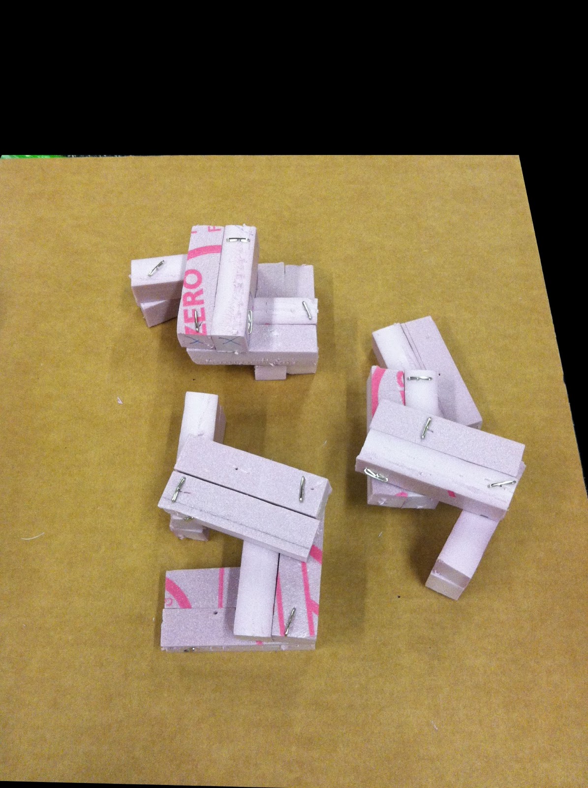
Several of the proposed iterations were tested both in model and in sketch up to look at how they interacted when replicated and to look at the views from and into the units in the development.  The goal is to have a tightly knit grouping of units that avoids direct views on the same level into neighboring units.


Interweaving forms inspiration: Glucksman Gallery, University College Cork, Ireland
O'Donnell Tuomey Architects
 

forecourt
 
river view

 
A configuration that utilizes all of the same components in each unit with just slight alignment offsets was settled upon and then tested for unobstructed views with consistent window placement in similar units.


It was also incorporated into the unit layout to have selected community space built into the layout of the three building groupings.  This idea was drawn from Lafayette Park and the shared underground space that allows for interior access to other units as well as trash disposal.  It is proposed that similar uses may be incorporated into this "alley" of space- possibly underground.


Preliminary diagrammatic layouts were proposed for the units interior spaces and interior circulation.


Floor 1
 

Floor 2
 

Floor 3


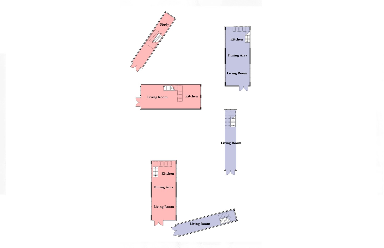
From these preliminary layouts- more formulated layouts were tested.

Initial Floor Plan Layout:


Square footage of these unit layouts was measured to test for feasibility.

Unit 1: ~1200 SF
Unit 2: ~1200 SF
Unit 3: ~750 SF
Unit 4: ~1500 SF
Unit 5: ~1200 SF
Unit 6: ~1200 SF

Although the SF of the units reflect generous unit sizes some of the spaces were still small and less user friendly than others.
Therefore, a "bump out" component, that is approximately 4' deep and 18' long was proposed as a strategic add on for some of the units to positively enhance the smaller floor plates.
Finally, one double unit was modified by adjusting the corner angles to create a better interaction with the exterior and other units.

Modified Floor Plan Layouts


Perspectives were also sketched and hand-rendered to test exterior views and scale.


Thursday, April 18, 2013

Prototype Development


Interweaving forms inspiration: Glucksman Gallery, University College Cork, Ireland

http://www.odonnell-tuomey.ie/webpage/ucc/2_gluck.htm

Gallery in treetops

interior

Bay window

north elevation

model


Additional iterations of forms and alignments were tested to arrive at a solution that allows for a variety of home configurations, a physically close community, and limited views into adjacent units.


A configuration that utilizes all of the same components in each unit with just slight alignment offsets was settled upon and then tested for unobstructed views with consistent window placement in similar units.


Each building houses two multilevel units ranging from studios to 2-bedrooms.  


Roof gardens are incorporated into the design and community garages independent of the housing units are proposed.  Based on window placement for views, the facades of the buildings were formed as one mass, assuming a uniform finish on the exterior. 


It was also incorporated into the unit layout to have selected community space built into the layout of the three building groupings.  This idea was drawn from Lafayette Park and the shared underground space that allows for interior access to other units as well as trash disposal.  It is proposed that similar uses may be incorporated into this "alley" of space- possibly underground.


Next, the proposed units were digitally modeled to solve circulation and unit layout in regards to unit access and window placement.


Finally, preliminary layouts were proposed for the units interior spaces and interior circulation.

 Floor 1


 Floor 2


Floor 3


The next step is working on refining interior layouts, views, and key interior moments.